Quantcast
Channel: Tales of a Red Clay Rambler
Viewing all 170 articles
Browse latest View live

Under 50 at the Schaller Gallery

$
0
0

Sue Tirrell


Guillemo Cuellar


Kent McLaughlin


Marty Fielding


S.C. Rolf


Check out the Schaller Gallery's new show Under 50. Its a good looking collection of work all priced under $50. These are a few of my favorites from the group. The bottom mug is one of the four that I have included in the show which runs from August 22- September 10th at www.schallergallery.com.

The Sue Terrill plate is pretty amazing for its balanced use of color. I'm also a big fan of Marty Fielding's sense of balance on this mug. Guillermo Cuellar, S.C. Rolf and Kent McLaughlin's pots are all in the "standards" category for me. By this I mean they are like Jazz standards. Other potters might be using those same glazes to make similar forms but these guys "play" these versions so damn well it is hard to look away. These are the sort of pots that grow on you as you use them. Their subtleties shine as you spend quality time around a dinner table.


Can you teach creativity? Thoughts on a Chris Staley video

$
0
0


Click here to watch Chris Staley's video on creativity.

Chris Staley's short video got me thinking about creativity and the brain again. The central question "Can you teach creativity?" is one that I have heard bouncing around many art studios at different times. One camp usually answers "no" followed by some version of "some people are just more creative than others". The other camp usually says "yes" which is followed by some version of "all people are creative".

I fall in to the "yes" camp, but I've also experienced that some people act more creativity than others. The key word here is ACT more creatively. Through years of my own learning and research into neural anatomy I have come to believe that creative thought is generated by action. The myth behind the creative genius is that their brains are built to have more creative thoughts. A more realistic statement is that an individual who engages in consistant creative activity shapes his/her brain to have more creative thoughts. The differences in the neural structure of a creative "genius" and a regular person aren't given at birth. They are created as the individual experiences the world around them.

Creative action is a specific activity that has specific neural results. Brain development follows the same rules as muscle development. A routine of regular exercise naturally leads to a fit body the same way that a life built around creative action yields a mind that is creatively fit. One aspect of physical training that pertains to creativity is the need for variation. If you repeat a physical activity at the same duration and level of difficulty, the body first adjusts and then plateaus resulting in a lack of growth. The way to continue growth is to engage in physical activities that have variety. In the sports world this is cross training.

In the education world the idea of cross training is equally relevant. To teach creativity you must engage the mind in continually new ways. This includes aesthetic training but also surprisingly non-art-related training. Ceramic education is perfect for this because we need to learn so many different disciplines to be successful. My non-ceramic friends are always surprised that our education includes chemistry (glazes) and physics/structural engineering (kilns and ceramic forms). These seemingly non-art studies create benefits in our creative practice because their opportunities for problem solving shape the brain.

There are a whole host of theories about methods that can be used for priming the brain for creativity. Click here to watch neuroscientist Jonah Lehrer talk about increasing creative expression. He mentions the role that psychological interpretation of our surroundings can play in our creativity. He mentions a study where participants are given a basic creativity test in a blue room or a red room. Because blue is associated with the skyline and freedom, participants score higher than their red counterparts. The main point I want to make is that teaching creativity is about shaping our brains with creative exercise and then getting out of the way to let it do its job. The more creative activity the individual undertakes, the more their brain will produce creative ideas.

As I run across more blog posts and articles on creativity I am starting to think we might be asking the wrong questions about creativity. We might benefit from shifting the question from how to teach creativity in an institutional setting to how to teach individuals to craft questions that yield creative answers. The ability to set up aesthetic problem solving scenarios for oneself is a skill that continues to pay dividends long after a formal education is over. When interviewing for grad school I asked a professor, "What are the benefits of an MFA versus working in the field?" Her answer still interests me. (I'm paraphrasing.) She said that grad school asks different questions of a person than just working in the field. She went on to imply that a successful academic environment creates questions which at time are unanswerable, fueling an artist's studio practice. This external dialog starts in school but migrates inward as the artist leaves school.

I'll end this post with one of the questions that are at the core of my studio practice these days. I'd also love to hear other people's studio questions if you would like to share them on the blog.

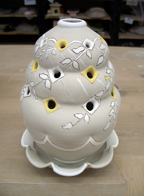
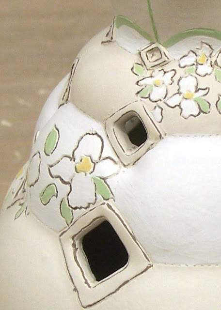
-How can I create an association in the viewer between honeysuckle patterns and the first smell of honeysuckle in the spring? Once a connection is made how does the memory of this smell relate to a feeling of growth or an inner longing for life?

-How can I create a volume that feels stable while also giving the impression that it is expanding?

-How much of an asymmetrical pattern reference is needed for the viewer to feel there is organizational cohesion within the piece?


Fresh from the kiln: Dinner plates and Platters

$
0
0


Lots of plates from last week's glaze kiln. These are all Yixing clay covered in porcelain slip and underglaze. The top five images are 9 inch plate sets and the bottom two are 14-16 inch platters.  I've been very happy with the depth I'm getting out of an electric kiln at cone 6. 

Week wrap up: Vases, bricks and Xi'an

$
0
0


I'm about to head out the door to take a tour group to Xi'an. This Chinese city is home to the Terra Cotta warriors and one of my favorite Chinese museums, the Shaanxi History Museum. Click here for a set of posts on the visit I took last year. 

Before I leave I thought I would do a wrap up post of this week's studio activities. Early in the week I put the finishing touches on a round of vases before moving onto flower bricks. The form language between the two forms is very similar but the end product will be very different. The second to last image is a flower brick that will have a diamond shaped hole cut at every dimple. Looking forward to making a few more of these when I return next week.

Hope everyone has a nice weekend.

Pete Pinnell on Cup: The Intimate Object

$
0
0


I spent the morning packing up my cups for this year's Cup: The Intimate Object exhibition. This yearly show at the Charlie Cummings Gallery is now in its eighth year. A few years back juror Pete Pinnell recorded a short video that covers many important ideas about hand made ceramics and their place in the art world. I always appreciate the simplicity with which he structures an explanation. If you haven't seen this video already I highly recommend you watch it. (Click here to watch it on YouTube.) Most of the video is quote worthy, but one particular sentence jumped out at me. It sums up the relationship between proximity and intimacy that fuels my desire to work within a hand held scale.

"One of the great powers of the cup, the simple cup, is that it immediately enters the viewer’s most intimate zone. The cup right away develops a level of intimacy that we would reserve for a lover…not for a stranger."

In this quote proximity is a method to increase intimacy. Another method would be to design the object itself to encourage intimacy. Either through volume or texture I entice people to handle my forms. (These potters make pots that I want to pick up as soon as I see them. Chris Gustin, Geoffrey WheelerChris Staley) Through the act of cradling I want the user to humanize the form. The fullness of a bowl and the bulge of a pitcher call to mind the curves of the human body that create a desire to be held.

The yunomis I am sending for The Intimate Object show my recent jump into carving textures. I hope they are touch worthy cups that find a good home. The show opens in October at www.claylink.com.


Tales of a Red Clay Rambler Podcast: Ep. 8 Jazz Saxophonist Willow Neilson

$
0
0


This week on the Tales of a Red Clay Rambler Podcast I have an interview with Jazz Saxophonist Willow Neilson. Nielson studied at the Sydney Conservatorium of Music before embarking on a music career that has taken him to Europe, Asia, the United States, and his native Australia. Settling in Shanghai in 2007 Neilson has become a seasoned member of the Chinese Jazz scene. His recent album Lighbulb Life incorporates influences of many world music traditions as well as public sounds he has recorded from Shanghai's streets.

In the interview we discuss his early musical influences, the affect martial arts has had on his playing, and the ability to loose oneself through musical improvisation. You can download Light Bulb Life through the album's band camp site. Click here to visit. You can also find out more about Neilson at his website www.willowneilson.com.

Check out Neilson's video for Microcosm, the lead off track for Lightbulb Life. You can also watch a video of him covering the Charlie Parker tune Ornithology on his You Tube channel.

Thoughts on the Hand

$
0
0


This week I've been thinking about hands, fingers and the sense of touch.

-Every ceramic artist comes to a crossroads in their studio where they must ask themselves, "How much evidence of the hand do I want in my work? How much do I want a sense of touch to be part of the finished object?" Mold makers often forge a path that emphasizes clean untouched surfaces that are reminiscent of shaped metal and stone. Uniformity is the goal and the quest for "clean" is undertaken as an aesthetic focus. Throwers on the other hand turn the other direction emphasizing variation and irregularity in their surfaces. "Fresh" becomes the focus as the potter quests for the perfect gestural line or bulge. Although I use molds on occasion I definitely fall into the thrower category. I can't get enough of the fleshy quality that freshly manipulated clay has on the wheel. I push it, pull it and bend it as I touch it from all angles. My finger marks are evident at every stage from the forming to the decoration.


-The hand is intimately tied to our brain because of the importance touch plays in our interactions with the world around us. "In fact, the hand is a privileged part of the body. It is represented by about 15% of both the sensory and the motor cortex of the brain, although the hand occupies a far smaller proportion of the total surface area of the body. Recognition by touch is also represented within the parietal association cortex. Thus the hand appears to eat up a substantial proportion of our sensory and computational powers."
Bruce Metcalf The Hand: at the Heart of Craft

-"The finger has hundreds of sensors per square centimeter" says Mark Goldstein, a sensory psychophysicist who cofounded MommaCare a company devoted to training nurses and physicians in the art of the clinical exam. " There is nothing in science or technology that has even come close to the sensitivity of the human finger with respect to the range of the stimuli it can pick up. It's a brilliant instrument. But we simply don't trust out tactile sense as much as our visual sense."
Malcolm Gladwell- The Picture Problem from What the Dog Saw

-I ran across the above passage from psychophysicist Mark Goldstein last week and immediately thought of this iconic Johnny Cash image. It has graced tshirts, stickers and ads as a sign of the rebellious spirit that has often gone hand-in-hand with the life of a musician. In the image Cash was about to play one of his infamous prison concerts at San Quentin State Prison when photographer Jim Marshal turned to him and said "John, let’s do a shot for the warden". Cash responded with a gesture and an image was born that helped cement Cash's reputation as country music's bad boy.

In the Studio: Flower Bricks

$
0
0


I've had a blast revisiting the flower brick form. I took a break from it for a couple of years, over which time I changed my approach to surface decoration. I'm coming back to it with fresh eyes but hands that know their way around the form.


They all start as manipulated pillow-like forms. At this point in the process I'm looking to divide space on the pot. I'm trying to set up multiple decorative possibilities that will come to resolution later. The image below shows you the choices I made from soft brown pot to fully decorated form.


With these forms I enjoy the way the decoration comes together at the top of the pot. I've recently been collecting conical farmer's hats and Taqiyahs (aka Kufi), the hats that muslim men wear. Both of these have interesting solutions for the way an intense pattern terminates. The images below show the relationship between the side decoration and the top view. You can also see a top angle of the plates that I have been making to go under the form. I enjoy the way the plates rim interacts with the impressions on the form.


This last batch included two new variations on the form. I added a taller neck that will raise the long stemmed flowers well above those that come out of the lower part of the form. I think this space will help both groups of flowers look better. The second innovation is changing the holes cut into the form from round to a diamond shape. This part isn't totally resolved yet but they are moving in the right direction.


To wrap this post up I want to show a past version of this form. This one dates back to my Odyssey days, circa 2005. The original was in porcelain and was much larger. The platters below the form are around 14 inches. It was made as a table centerpiece where as the new ones are more compact and function like a normal vase.


Tales of a Red Clay Rambler Podcast: Ep. 9 Ceramic artist and educator Shoji Satake

$
0
0


This week on the Tales of a Red Clay Rambler Podcast I have an interview with ceramic artist and educator Shoji Satake. His mixed media sculpture combines cast ceramic forms with found objects that are reminiscent of flowers growing from a rocky landscape. Now the head of the ceramics department at West Virginia University Satake directs their Morgantown campus as well as their long standing study abroad program in Jingdezhen, China.

In the interview we discuss his early work in politics, the evolution of WVU's ceramic program, and the social media projects that spring from his often humorous and subversive brand of social commentary. For more information on Satake's work please visit http://shojisatake.com. If you would like to find out more about the WVU study abroad program please visit their website by clicking here.

New work fresh from Photoshop

$
0
0


I keep promising myself I'll blog about my recent travels but those posts are getting pushed farther down the to-do list. This week has been dedicated to glazing, packing and photographing. I shipped out 7 boxes today and hopefully I'll get the last few out tomorrow. The business side of this clay business always takes more time than I think it should. 

Here are a few shots that I enjoyed from recent shoots. I especially dig the last one of the smallest teapot I have made to date. It is tiny but it packs a punch! The others you might notice from previous In the Studio posts. Seeing the work glazed always gets me pumped to make some more. The finished product is the visual reward that follows the rewards of making.

Shanghai University International Artist Residency

$
0
0


These images where taken during a week long workshop/symposium at Shanghai University. Nine artists from China, Japan and the U.S. got together to work in the studio and eat alot of good Chinese food. The participating artists are Chen Guanghui, Wu Hao, Yu Ping, Wan Li Ya, Yu Hongbin, Takeshi Yasuda, Shawn O'connor, Dryden Wells and myself. A huge thank you to Stephanie Chung for providing these images and to Chen Guanghui for organizing the workshop.


One of my favorite aspects of the workshop was working beside Takeshi Yasuda. I soaked in as much of his demonstrations as I could. I found myself continually stopped on my wheel watching what he was doing. I was also fortunate to sit down with Takeshi for an interview that covers his fifty year career in clay. He will be on the next episode of the Tales of a Red Clay Rambler Podcast which I hope to post some time this week.


Shawn O'Connor


Wan Li Ya


Wu Hao


Yu Hong Bin's sculptures


Dryden Wells


Chen GuangHui


For my five days in the studio I focused on designing a new British style teaset complete with teapot, cups/saucers and a sugar/creamer set. This was a test run for the forms I hope to perfect during my Denmark residency at Guldagergaard starting next week. I'm looking forward to digging deeper with this set.


I also worked with the flower brick form that I have been developing recently. I decided to super size it. Great fun to work at the 18 inch scale.

This workshop will be capped with an exhibition in early December at the Shanghai University Gallery. I'll post more images of the exhibition when it is installed.


Takeshi Yasuda on Episode 10 of the Tales of a Red Clay Rambler Podcast

$
0
0


This week on the Tales of a Red Clay Rambler Podcast I have an interview with Japanese ceramic artist Takeshi Yasuda. Over his fifty year ceramic career he has received world wide recognition for his functional pottery. His latest body of work features celedon glazed forms thrown in porcelain. He often accentuates his forms with loose gestural lines created by the slow turn of the potters wheel. 

Takeshi moved to the U.K. in 1973 and has maintained a studio there ever since. He has taught at various educational institutions including the University of Ulster, where he was a professor of applied arts. From 2005 to 2010 he served as the director of the Pottery Workshop in Jingdezhen, China.

In part one of the interview we discuss establishing his first studio in Mashiko, Japan. In part two of the interview we discuss the development of his ceramic voice, and his experience living in the U.K. If you would like to see more of Takeshi's work you can visit his website by clicking here

To subscribe to the podcast on iTunes please click here. You can also stream the latest episode on the new podcast tab for the site. Click here to listen.


Takeshi's previous bodies of work include a three color series influenced by the Tang Dynasty and a cream ware series of porcelain ceramics. While his touch with clay has remained the same his surfaces and forms have varied greatly through out his career. I admire his ability to evolve and change styles.

Highlights from Cup: The Intimate Object 8

$
0
0

Donna Flannery


Simon Levin and Amy Smith

We have officially reached what I heard another potter call "the cup season". In recent years November has become the official month for cups shows. This year you can find just about every approach to the cup in Sante Fe Clay's Handle with Care, Crimson Laurel's Source: Material, and Charlie Cummings Gallery's Cup: The Intimate Object 8.

My hope is that competition in the marketplace will encourage artists to put more energy into innovation. It is surprisingly hard to make an original cup design. It is even harder to making an original cup design that functions well. The angle of the rim, the edge of a handle and the depth of a trimmed foot are all aspects that can make or break a cup. So many cups look great in the gallery but don't make it into the daily rotation because of a minor flaw.

The images in this post are from cups that intrigue me. For some it is color (Donna Flannery, Sanam Emami), some form (the 3 versions of cup w/ stand from above), while others it is content (Josh Stover's K is for Kettle). These are only a small offering of the hundreds that are available at www.claylink.com. I also encourage you to check out the artist's websites that are hot linked to their names to see how these cups fit into, or stretch the artists current bodies of work.


Josh Stover's K is for Kettle Mug.


Julia Galloway

I am now the proud owner of this Julia Galloway mug. Looking forward to seeing those runny blue clouds in person when I get back to the States in December.


This yunomi is one of the selection that I sent for the show. To see more of my cups please click here.

A week in France: Notre Dame Cathedral

$
0
0


I am a long time fan of religious spaces. The act of prayer seems to leave a residue on the structures that house those in worship. While this could be seen as supernatural I believe the "specialness" of these environments comes from the human side of the spiritual equation. One of the greatest human capacities is the ability to create meaning through action and ritual. When a society practices ritual over a long period of time the meaning and devotion associated with these rituals is transfered to the objects surrounding them. As a result of our collective action, objects and their environment take on a karma of their own. 

As I walked into the Notre Dame Cathedral last week I was hit with a huge dose of awe. The sight of flickering candles mixed with the eerie sounds of the organ set a quiet but emotional mood. I am not sure if I witnessed the collective karma of millions of worshippers, or if I was just being visually impressed at first sight. Either way the experience left a mark. Surrounded by a mixed procession of the faithful and throngs of tourists I soaked in the hushed atmosphere. 

The expansive vaulted ceiling rises more than 120 feet above your head as you walk through the space. Cathedral architects employed massive contrasts in scale between viewer and building to represent the human relationship with an all powerful God. The humility I felt is exactly the feeling they were trying to create. We are supposed to feel small but safe. Structures such as Notre Dame provide a solid example of the power design has to stir our emotions.

One of my favorite aspects of the visit was seeing the treasury. This collection of religious objects is housed in a wing adjacent to the main sanctuary. (To find out more about the treasury click here.) Every object, from robes, to sensors, to communion implements has been used in some aspect of worship since the cathedral started construction in 1163. From a decoration standpoint I was impressed with the level of ornament on the objects. They are covered with symbols of religious devotion, church power and status. The Shrine for the Crown of Thorns pictured above is a great example of mid 19th Century precious metal work.

To see more images of the cathedral you can visit the gallery on my Facebook fan page. You can also see an interactive panoramic view of the cathedral on the Notre Dame website.

A week in France: The palace at Versailles

$
0
0


It is hard to believe that one of the crowning achievements of French architecture started as a hunting lodge. From its some what humble beginning the palace at Versailles evolved into a symbol of French power and excess. It served as the seat of government from 1682-1789 and housed the monarchs from Louis XIII to Louis XV.

Our tour started in the King's state apartment, a lavish group of rooms overlooking the courtyard of black and white marble. In the time of the monarchs the King and Queen did not share the same chambers. To better serve their roles as host and hostess of the French court they had separate apartments where they could entertain dignitaries and important visitors to the court. Luckily for a visitor like me this means there are endless rooms that needed decorative arts including furniture, metal work, and ceramics. Wandering from room to room I was amazed that the royal treasury wasn't completely drained in the building and decoration of Versailles.


After a short time in the main palace we ventured out into the gardens. Equally as famous as the architecture the gardens where intricately designed, and redesigned, by each monarch. The gardens give way to the Grand Trianon and Petit Trianon. Both of these structures where later additions to the palace compound. They show the evolution of French architecture and style over the centuries that Versailles was constructed. While the palace compound expanded, ornament lessoned from the Baroque to Roccoco to Neo classical periods. One thing that did not change was the love of gold. (Gilded bronze was often used in place of actual gold.) No building was short on this important symbol of power. 

Seeing the gold lined walls of the Kings apartment helped me understand why gold lustre was used so heavily in ceramics made in the Sevres factory. Above you can see part of a table service that fit perfectly in a room full of gold trim. My next post will be on the Sevres museum and the ceramics that have been produced in the factory since the late 1730's.


The pink marble of the Grand Trianon was one of the high lights of the palace compound.


Versailles boasts more than five million visitors a year. In addition to the plethora of photographs taken every year the compound has appeared on the silver screen. In Marie Antoinette Kirsten Dunst is cast as the most famous French queen. The movie is filled with the pomp and circumstance of the French court. There are many great shots of the palace and the compound. Click here to view the trailer for Marie Antoionette.


Wrappable at the Lux Center

$
0
0


Happy to be included in the Lux Center's winter show Wrappable. It opened last week and runs until Christmas eve. If you are within driving distance of Lincoln, NE this would be a great place to buy American craft for the holidays. They have turned their gallery into an all out Christmas market complete with ceramics, fibers, paintings, glass and an assortment of other items. Click here to view images on their Facebook page. The platter and flower brick above are part of the batch I sent for the exhibition.

I am in privileged company for the show including the following ceramic artists:
Margaret Bohls, Sara Truman, Naomi Mostkoff, Crisha Yantis, Chandra DeBuse, Victoria Christen, Sean Scott, Conner McKissack, Jose Sierra, Pam Huckins, Kelly Rush, Gerit Grimm, Ryan LaBar, Matt Bukrey, Stephanie Leach-Vendetti, Dawn Dishaw, Bryce Brisco, Aaron Sober, Amy Santoferraro, Kelly McKibben Harro, Sue Tirrell, Susan Stark-Johnson

A week in France: Ceramic museum at Sevres

$
0
0

Peacock Platter Iznik Turkey

French platter from Saintonge 1600-1630

Conversion of Sergio Paulus by Nicola de Urbino Italy 1525-1530

Cuerda Seca Rabbit Bowl from Seville 1500-1525

Lustreware Platter Spain 1450-1500

On the outskirts of Paris sits the small suburb of Sevres. Home to the Sevres ceramic factory and museum this area has been producing ceramics since the middle of the 18th century. The museum hosts a broad collection of European ceramics highlighting decorative functional traditions. Seeing pieces from many cultures side-by-side helps show the evolution of decorative style across Europe. I spent a few hours with the collection and got to see some of my favorite pots from around the globe for the first time in person.

The grouping of Turkish Iznik ceramics in the museum brought a huge smile to my face. The peacock platter above is a great example of the balance Iznik decoration draws between asymmetry and symmetry. The peacock rests in the middle ground behind two feather/floral motifs that sit slightly off the center point of the plate. The composition is grounded by a singular chain of flowers that stretch along the bottom of the circle. To balance the activity of the middle section, the rim of the pot has a symmetrical pattern loaded with white negative space to let your eye rest. Every one of the plates on display was an education in balanced decoration.


Olivier Tureen 1770-1780

Pierced tureen made at Sevre

The roots of the Sevres factory lead back to Louis XV's mistress Madame Pompadour who moved a ceramic factory from Vincennes to Sevres in 1756. With the switch the factory served as the official production center of French ceramics. Numerous artists designed forms and patterns for the company often working in disperate styles and drawing from a range of sources.

The two tureens pictured above are a good example of two designers reacting in different ways to the same form. They form a nice contrast between additive and subtractive forming methods. The top piece has the fresh look of the soft clay sprigs that were attached to the form. The patterns on the bottom tureen have harder edges that were probably caused by carving or piercing a master form. Both show the complexity of form that could be created under the direction of master mold makers.


Delft Tulipiere - Netherlands


Flower Brick Berlin Germany 18th Century


Flower Brick made at Sevres 18th Century

The museum has an inspiring collection of flower bricks including examples from the Netherlands, Germany and the Sevres factory itself. I have this form on my studio list for the near future. Click here to see images of my last grouping of flower bricks.

To see more images from my trip to Sevres please visit my Carter Pottery Facebook page by clicking here.

American Wood Fired Potter Shawn O'Connor on the Tales of a Red Clay Rambler Podcast

$
0
0


This week on the Tales of a Red Clay Rambler Podcast I have an interview with American ceramic artist Shawn O'Connor. Specializing in wood firing O'Connor uses flame and ash patterns to produce rich surfaces that emulate river rocks and rusted steel. He has a MFA from Syracuse University and has been a resident at the Watershed Center for Ceramic Art and the Arrowmont School for Craft.

As well as enjoying Shawn's work I like his writing about family dinning and wood firing. Writing about his work he states, "My home growing up was strongly focused around the family. Family dinners were important and rarely missed growing up. My extended family gathered quite often for social events such as birthdays and holidays that always revolved around food. I would like to extend this sense of comfort and warmth through my work to others who use it."

"Firing with wood also came with my upbringing. I was raised in a rural Maine home that was heated with a wood stove during the cold winter months. This meant that the fire was constantly being fed in order to heat the house. This required a lot of work and attentiveness to the fire. Preparing a winter's worth of wood required many days of hauling, splitting, and stacking. This process was instilled in my life from an early age. I have always found the physical labor, the rhythm, and the sense of accomplishment that comes with this process enjoyable."

In the interview we talk about the influence of family dinning on the desire to make functional ceramics, accessibility in contemporary art, and developing a unique wood fire aesthetic. To see more of O'Connor's work you can visit his website by clicking here. You can also find more about his work through the galleries that carry his work Akar Design, Red Lodge Clay Center, and The Clay Studio.

To subscribe to the Red Clay Rambler podcast on iTunes please click here. You can also stream the latest episode on the new podcast tab for the site. Click here to listen.


Shawn uses small scale saggar firing to create localized flashing on his pieces. You can see the yunomi's wadded above small saggars in the picture above. He also has been using clay baffles to create specific patterns on his pots. In the image above the flame will pass through the trifecta of perforated rectangles to leave a mark on the pot's surface. To find out more about Shawn's firing process check out his article In Search of My Mark in Ceramics Technical No. 33 pg 87 – 91.


Cycles of the moon plate set.

Paint.Pattern.Print. - Online now at the Schaller Gallery

$
0
0

Michael Corney


Meredith Host


Ron Meyers


Daniel Ricardo Teran


David W. Bolton


Sebastian Moh

Just in time for Black Friday the Schaller Gallery opens Paint.Pattern.Print. Head over to www.schallergallery.com to check out the great group of artists. While you are there you can get all your Christmas shopping done early. 

The images above are a few of my favorites from the show. Click on the artists names to find out more about them. Participating artists include: Dan Anderson, Posey Bacopoulos, Michael Corney, David W Bolton, Ryan Greenheck, Ursula Hargens, Meredith Host, Melissa Mencini, Ron Meyers, Sebastian Moh, Jeff Oestreich, Daniel Ricardo Teran, Sue Tirrell, Paige Wright, and myself.

I have a new collection of work in the show including a new pitcher forms. Happy Thanksgiving and happy shopping!


Songs for the Danish Fall

$
0
0


Tallest Man on Earth- To just grow away

Swedish song writer Kristian Matsson's early Tallest Man on Earth albums are a convincing mimicry of early Bob Dylan mimicking Wood Guthrie. I don't mean this as an insult. I love every bit of his fingerpicked folk revivalist style. In his newest There's no Leaving Now Matsson leans electric and crafts one of my favorite albums of the year.


Alabama Shakes- Going to a party 

The Alabama Shakes' Brittany Howard has a memorable voice and plenty of stage presence to draw you into every word she sings. Her delivery has all the characteristics of an Etta James/Janis Joplin lovechild. Their debut album Boys and Girls showcases their simple but raucous old soul melodies.


The Lumineers- Stubborn Love

The Lumineer's "Stubborn Love" tills the fertile ground of the downtrodden lover. Much like Bill Withers classic "Use Me" the narrator disregards self awareness for the seduction of the revolving door relationship. You might recognize them from their catchy song "Ho Hey".

"SHE’LL LIE AND STEAL AND CHEAT, AND BEG YOU FROM HER KNEES
MAKE YOU THINK SHE MEANS IT THIS TIME
SHE’LL TEAR A HOLE IN YOU THE ONE YOU CAN’T REPAIR
BUT I STILL LOVE HER I DON’T REALLY CARE"
BRIDGE
"WHEN WE WERE YOUNG OH OH WE DID ENOUGH
WHEN IT GOT COLD OOH OOH WE BUNDLED UP
I CAN’T BE TOLD AH AH IT CAN’T BE DONE"


Bruce Springsteen-Wrecking Ball

At an age when many of his peers are drifting calmly into retirement Springsteen is creating songs with the same passion that has lead him through decades of music. Wrecking Ball is a rare anthem dedicated to a sports stadium. Giants stadium fell in 2010 but inspired the title track to Springsteen's 17th album.


Dawes with Mumford and Sons- When my time comes

Released first on their 2009 debut album North Hills "When my time comes" has become a crowd sing-a-long favorite. This version was recorded when they shared the stage with Mumford and Sons at the 20th Anniversary of WXPN's World Cafe. It is nearly impossible to listen to this and not feel like a teenager going out to conquer the world.

I've uploaded all of these to the music player on the Red Rambler blog. I hope you enjoy and as aways I love to hear your suggestions and thoughts on new music. 
Viewing all 170 articles
Browse latest View live